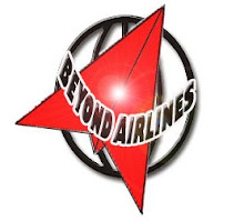
 Beyond Airlines logo consists of a globe and a paper plane image . This illustration was adopted after the company name. It certainly narrates the company’s high corporate reputation and class. The image of the paper plane in Beyond Airlines logo has been designed to hold supremacy, power and strength.
The globe shape is used to symbolise our around the world service. Our company operates in all parts of the world. The 5 lines that make up the globe represent the 5 continents in the world.
The paper plane symbolises our low cost flight service. The plane's end is shaped like a Concorde to show our grandness that is beyond customer's satisfaction.
Color of Beyond Airlines
The use of highlighting color is gracefully adopted in Beyond Airlines logo. Black, White and Orange are the colors utilized to enhance the beauty of the Beyond Airlines logo. Black is used to symbolise our determination to increase our dignity and pride of each staffs as well as to represent the brand's prestige. White represent the sincerity of the staffs to provides the best services to our customers. Our energy, determination and drive to strive for the best is represented by Orange color.
Font of Beyond Airlines Logo
A very simple and easy to remember typeface is employed in Beyond Airlines logo to enhance the characteristics of the company and its high quality service. The alphabets are done in bold font to impose a high status of the corporation market position.
No comments:
Post a Comment